Guidelines
Usage
Defining how we apply color to user interfaces
The use of color plays a key role in how we convey emotions, establish brand identity, and guide user interactions. Consistent and thoughtful color choices also improve usability, highlight important elements, and create a cohesive design language across the product.
Text
Text color can vary depending on the background surface. By default, text color should be neutral when on a neutral background (see Accessibility for more information WCAG color contrast ratio requirements.
General principles
- Use neutral values for general heading (strong) and body copy (default)
- Primary (Blue 400) is reserved for link color
- Use sparingly
- Refer to color themes for brand or feedback color guidelines
- Bold text should be at least 18.5px and 24px for non-bold copy on core values.
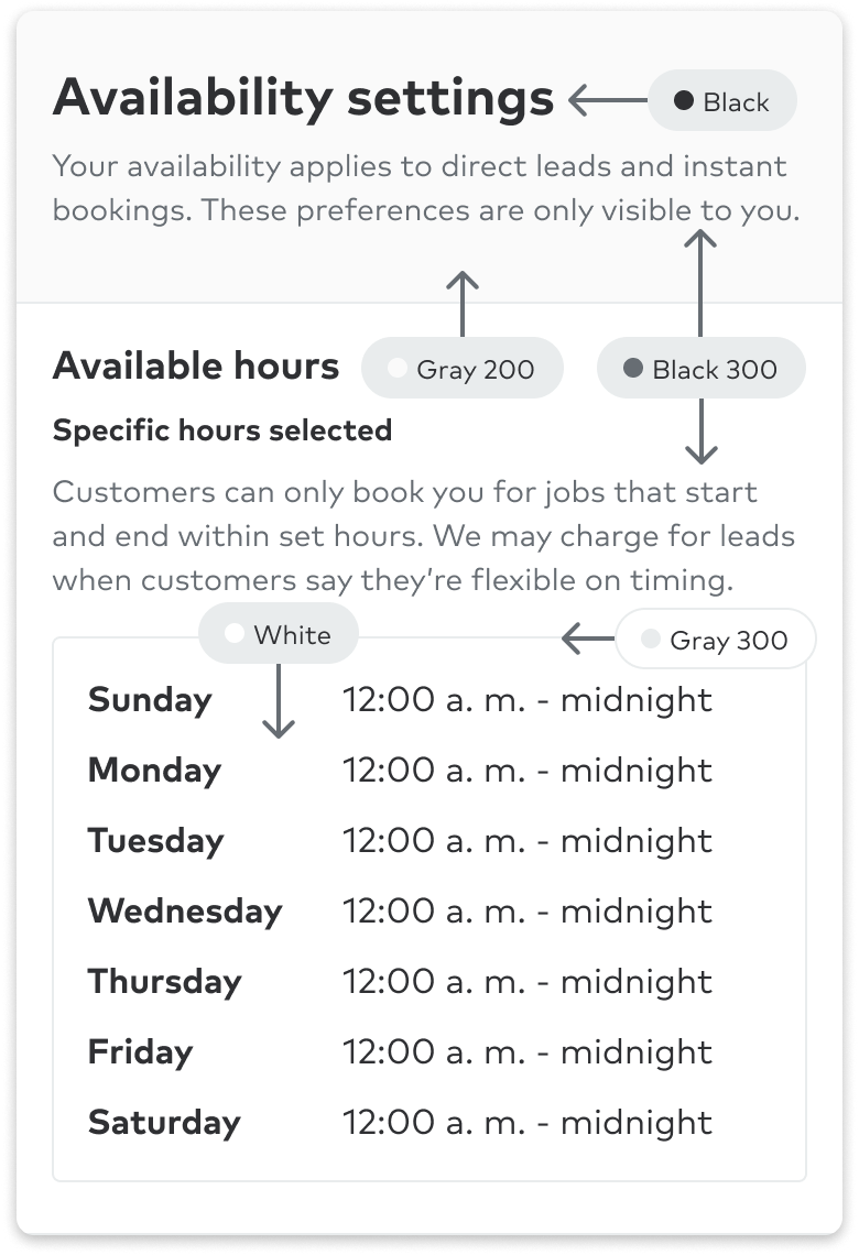
Neutral
Use to express default and less-opinionated UI elements such as background colors, icons, and text elements.
| Color | Emphasis | Interaction | Description |
|---|---|---|---|
Black | default | active | Copy on an active neutral or low emphasis surface |
White | inverse | Copy on any medium or strong surface color (ex: buttons, alerts) | |
Black | strong | Copy on a default neutral or low emphasis surfaces (ex: headings, links) | |
Black 300 | default | Body copy on a default neutral surface color |
Primary and info
Use our brand color to tie in the most important user moments with how we express ourselves as an organization through our identity. You can also use these in info moments.
| Color | Emphasis | Description |
|---|---|---|
Blue 600 | strong | Text color on 100-level primary surfaces |
Blue 500 | medium | Text color on default neutral default |
Blue | default | Text color on default neutral surface (bold text should be at least 18.5px and 24px for non-bold copy) |

| Color | Emphasis | Description |
|---|---|---|
Indigo | default | Text color on default neutral surface (bold text should be at least 18.5px and 24px for non-bold copy) |
Indigo 600 | strong | Text color on 100-level guidance surfaces |
Indigo 500 | medium | Text color on default neutral default |

Accents
Use as a subtle background for accent purposes.
| Color | Emphasis | Description |
|---|---|---|
Purple 600 | strong | Text color on 100-level accent surfaces |
Purple 500 | default | Text color on default neutral surface |

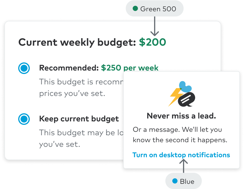
Success, finance and ratings
Use for positive monetary moments, like income patterns, discounts, savings, and revenue growth.
| Color | Emphasis | Description |
|---|---|---|
Green | default | Text color on default neutral surface success, completion, (ex: savings, discounts, revenue growth, etc) (bold text should be at least 18.5px and 24px for non-bold copy) |
Green 600 | strong | Text color on 100-level success surfaces success, completion, (ex: savings, discounts, revenue growth, etc) |
Green 500 | medium | Text color on default neutral default success, completion, (ex: savings, discounts, revenue growth, etc) |
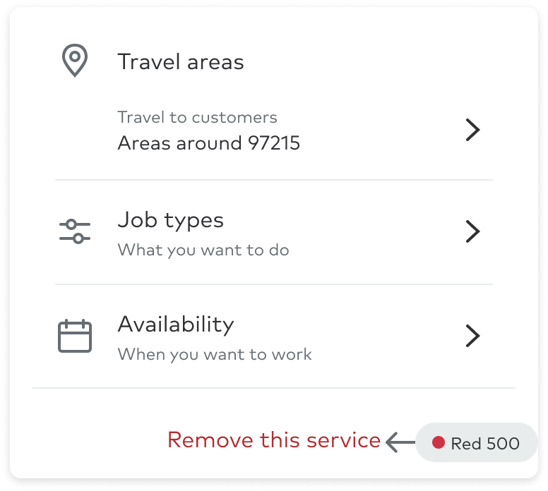
Alert
Use to convey a sense of urgency, to assist in preventing potential errors or security issues, and for negative monetary moments like revenue loss.
| Color | Emphasis | Description |
|---|---|---|
Red | default | Text color on default neutral surface (ex: revenue loss) (bold text should be at least 18.5px and 24px for non-bold copy) |
Red 600 | strong | Text color on 100-level alert surfaces (ex: revenue loss) |
Red 500 | medium | Text color on default neutral default (ex: revenue loss) |
Caution
Use for moments that are trending in a negative direction, but don't require the user to take immediate action.
| Color | Emphasis | Description |
|---|---|---|
Yellow 600 | strong | Text color on 100-level caution surfaces (ex: downward trends) |