Guidelines
Palette
A simple system for interfaces and illustrations
Core colors are expanded into a range of values to support varying moments within the product. The usage patterns for each value below can be found in our usage page.
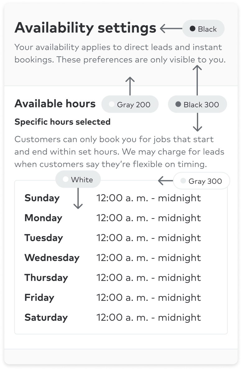
Use to express default and less-opinionated UI elements such as background colors, icons, and text elements.
Backgrounds, text, iconography, shadows.
- Highly important messaging with no intention for color or feedback (ex: Toast)
- Copy on an active neutral or low emphasis surface
- Copy on a default neutral or low emphasis surfaces (ex: headings, links)
- Default icon color on neutral surfaces
- Icon color caution on 100-level neutral surfaces or paired with text of same color value (ex: downward trends)
- Links on neutral surfaces with long lists or groupings of links (ex: footer)
- Default border on medium or with strong neutral backgrounds
- Body copy on a default neutral surface color
- Default border on low or neutral backgrounds (also used with neutral backgrounds with low emphasis) and on interactive elements (ex: TextInput)
- Icon color indicating empty states for icons (ex: empty star rating")
- Subtle awareness with no intention for color or feedback
- Default border on neutral surfaces
- Medium emphasis with no intention for color or feedback (ex: Messenger reply bubble)
- Default background color with no meaning
- Copy on any medium or strong surface color (ex: buttons, alerts)
- Icon color on medium or strong emphasis backgrounds and colored surfaces (also used on medium and strong colored surfaces)
- Links on medium or strong emphasis backgrounds (note: this text should use the underline style)
Examples
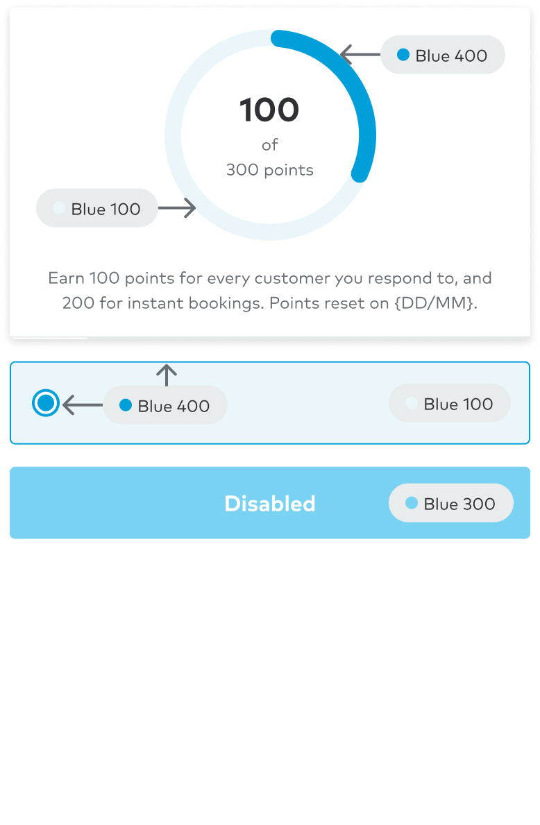
Use to drive focus and immediate attention to primary product moments. Overuse of this color is discouraged, so we can focus on the moments that matter.
Buttons, links, information, progress, promotional moments, brand moments, selected states.
- Interactive moments when hovering over default neutral backgrounds
- Selected or active neutral backgrounds over default neutral backgrounds
- Backgrounds for primary moments
- Disabled primary backgrounds
- Default border on neutral active background to add emphasis to selected or active states
- Selected or active neutral backgrounds in smaller spaces (ex: Calendar days)
- Important primary moments (ex: primary CTAs)
- Text color on default neutral surface (bold text should be at least 18.5px and 24px for non-bold copy)
- Icon color on a default neutral surface
- Links on link on a default neutral surface
- Hovering over neutral links.
- Highest level of importance for primary moments
- Text color on default neutral default
- Icon color primary on default neutral surfaces or paired with text of same color value
- Links on blue 100-level or gray 300 surfaces
- Text color on 100-level primary surfaces
- Icon color primary on 100-level blue surfaces or paired with text of same color value
Examples
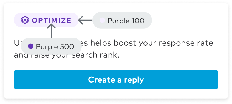
Use as a secondary color to guide users through onboarding, user assistance, map overlays, and data visualizations.
Data visualizations, informational moments, user assistance.
- Backgrounds for guidance moments
- Important guidance moments
- Text color on default neutral surface (bold text should be at least 18.5px and 24px for non-bold copy)
- Icon color on a default neutral surface
- Highest level of importance for guidance moments
- Text color on default neutral default
- Icon color guidance on default neutral surfaces or paired with text of same color value
- Text color on 100-level guidance surfaces
- Icon color guidance on 100-level indigo surfaces or paired with text of same color value
Examples

Use as a subtle background for accent purposes.
Data visualizations, informational moments, user assistance.
- Subtle background for accent purposes
- Text color on default neutral surface
- Icon color on a default neutral surface
Examples
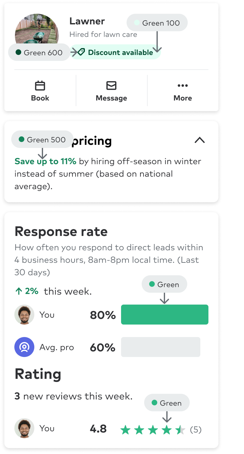
Use for ratings or to express growth, upward trends, financial moments (cost figures, savings, discounts, etc..), and positive feedback.
Positive moments, savings, discounts, upward trends, growth, ratings.
- Backgrounds for success moments success, completion, (ex: savings, discounts, revenue growth, etc) and ratings
- Important success moments success, completion, (ex: savings, discounts, revenue growth, etc) and ratings
- Text color on default neutral surface success, completion, (ex: savings, discounts, revenue growth, etc) (bold text should be at least 18.5px and 24px for non-bold copy)
- Icon color on a default neutral surface success, completion, (ex: savings, discounts, revenue growth, etc)
- Highest level of importance for success moments success, completion, (ex: savings, discounts, revenue growth, etc) and ratings
- Text color on default neutral default success, completion, (ex: savings, discounts, revenue growth, etc)
- Icon color success on default neutral surfaces or paired with text of same color value success, completion, (ex: savings, discounts, revenue growth, etc)
- Text color on 100-level success surfaces success, completion, (ex: savings, discounts, revenue growth, etc)
- Icon color success on 100-level green surfaces or paired with text of same color value success, completion, (ex: savings, discounts, revenue growth, etc)
Examples
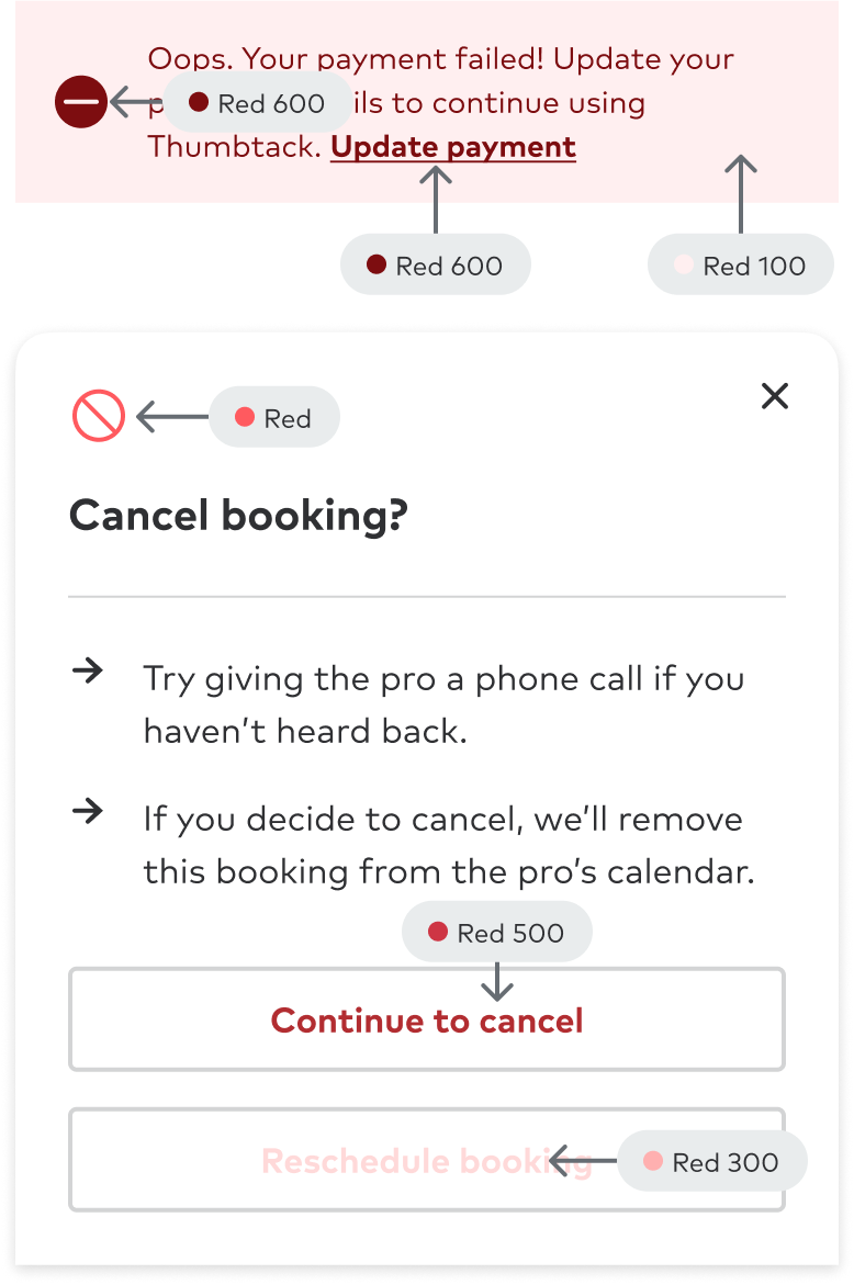
Use sparingly to not deter from important moments that require the user’s immediate attention.
Feedback moments, alerts, negative impact, cancellations, deletions and urgency.
- Backgrounds for alert moments
- Disabled alert backgrounds
- Important alert moments
- Text color on default neutral surface (ex: revenue loss) (bold text should be at least 18.5px and 24px for non-bold copy)
- Icon color on a default neutral surface (ex: revenue loss)
- Text color on default neutral default (ex: revenue loss)
- Icon color alert on default neutral surfaces or paired with text of same color value (ex: revenue loss)
- Highest level of importance for alert moments
- Text color on 100-level alert surfaces (ex: revenue loss)
- Icon color alert on 100-level red surfaces or paired with text of same color value (ex: revenue loss)
Examples
Use to bring additional energy to the ux and provide cautionary moments of user feedback.
Feedback with a subtle sense of caution. Commonly used in alerts and toasts.
- Backgrounds for caution moments
- Important caution moments
- Icon color on a default neutral surface (ex: downward trends)
- Highest level of importance for caution moments
- Text color on 100-level caution surfaces (ex: downward trends)
- Icon color caution on default neutral surfaces or paired with text of same color value (ex: downward trends)
Examples