Components
Modal
Overlays to provide highly contextually user guidance
Need Modal v1 documentation?
Usage
Modal dialogs appear as an overlay on a page. They should be used when Thumbtack requires a user response or needs to explain critical information without losing context of the page beneath it.
Use when you want a user to confirm an important action or to get information like signing up or logging in. Since modals do interrupt a users’ experience, they could be perceived as annoying or bothersome and should be used with discretion.
Do not use a modal without a trigger from the user, for example on page load. Also, do not use if there is a modal already being displayed.
Behavior
Arrival
How modals arrive is just as important as the content they contain. Animation does more than provide a visually pleasing experience. They indicate to the user that there is something on top of the content they are interacting with.
Dismissing
By default, modals can be closed by clicking on the “x” in the upper right hand corner of the container or by clicking anywhere outside of the container which is called the “curtain”. The animation of the arrival is used, just in reverse.
Autofocus
By default, the focus is placed on the first item a user can select, allowing them to quickly select the requested information, or submit the modal.
Anatomy
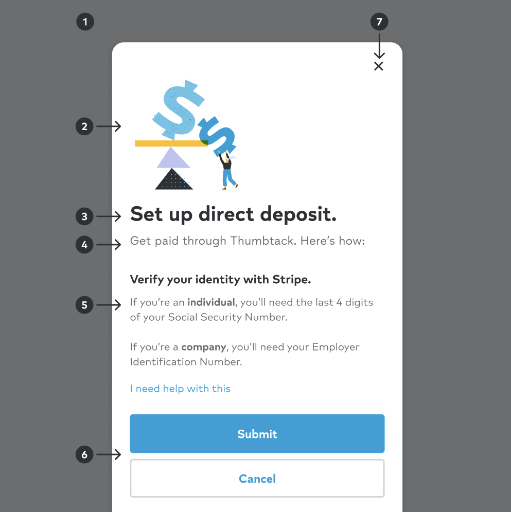
1
Scrim
Covers the underlying content while providing focus to the information being served in the container.
2
Illustration
Visual tie-in to modal messaging. Uses artwork from the illustration library. Should be omitted if no value add.
3
Title
Reinforces context from the initial trigger on page while providing an overview of the modal.
4
Description
Introductory text that supports the title and overall intention of the modal.
5
Content
Primary information, interactive elements, or a specific task is presented to the user. This will the scrollable region if content is taller than the modal height.
6
Actions
Contains the primary action of the modal. All modals must have a primary CTA, and can support secondary CTA's as well. These actions should speak to and reinforce completing the action they are being asked to complete.
7
Close action
UI element to close the modal experience, including the underlying scrim.
Modal Types
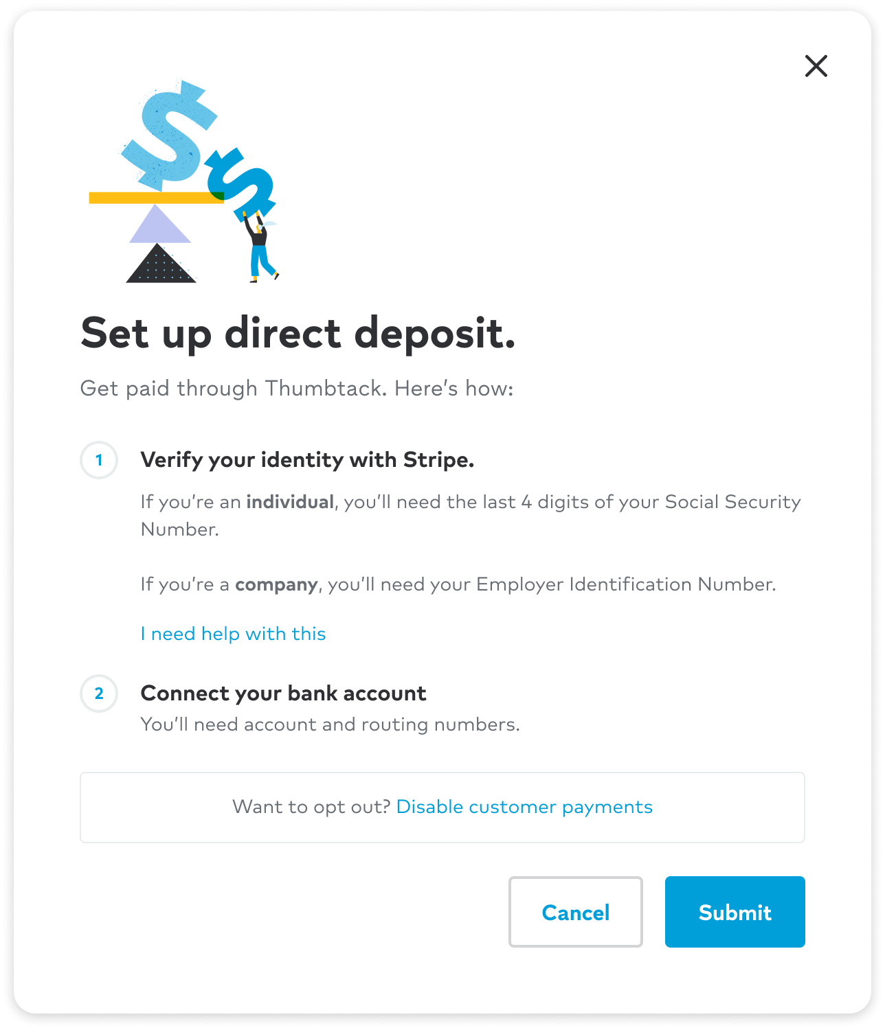
Modals are offered in three types to best suit the user experience needs.
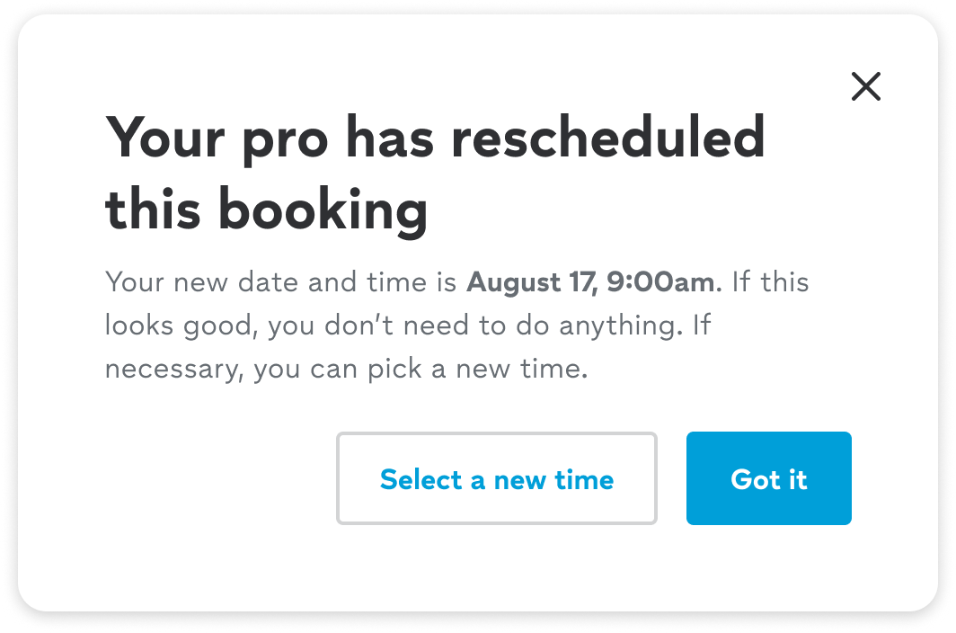
Default
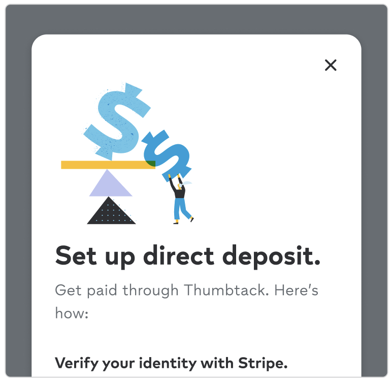
Standard dialog that temporarily overlays the main content of a digital interface to present additional information, options, or interactive elements to the user within the current context of the experience.
Promo
Visually engaging modal approach used to be part of a marketing strategy to drive user engagement and conversions by grabbing the user’s attention through strong visual headers.
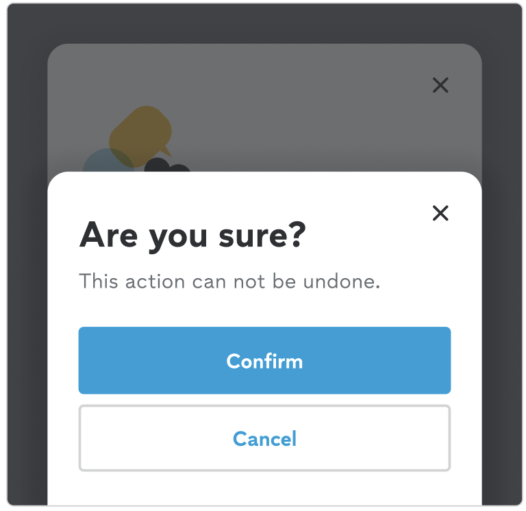
Confirmation
Clear and concise options to confirm or cancel the action, providing a moment for the user to review their decision before proceeding.
Default
Standard dialog that temporarily overlays the main content of a digital interface to present additional information, options, or interactive elements to the user within the current context of the experience.
Sizing options
Modals are offered in multiple widths for the large responsive breakpoint or desktop experience. Selection of sizing should is dependent on the intended use case.
| Name | Size | Description |
|---|---|---|
| Default | 624 | Most commonly used content such as forms and contextual informational. |
| Small | 512 | Minimal content and basic messaging such as confirmation modals. |
| Medium | 740 | Complex illustration and information non-suitable for the default size. |
| Large | 1025 | Largely complex content and content such as tables, data etc. |
Promo
Visually engaging modal approach used to be part of a marketing strategy to drive user engagement and conversions by grabbing the user’s attention through strong visual headers.

Confirmation
Typically appears after the user has initiated a significant action, such as deleting a file, submitting a form, or completing a purchase, to ensure that the user understands the consequences of their action and to prevent accidental mistakes.
Best practices
Arrival
How modals arrive is just as important as the content they contain. Animation does more than provide a visually pleasing experience. They indicate to the user that there is something on top of the content they are interacting with.
Dismissing
By default, modals can be closed by clicking on the “x” in the upper right hand corner of the container or by clicking anywhere outside of the container which is called the “curtain”. The animation of the arrival is used, just in reverse.
Autofocus
By default, the focus is placed on the first item a user can select, allowing them to quickly select the requested information, or submit the modal.
Accessibility
Autofocus
By default, the focus is placed on the first item a user can select, allowing them to quickly select the requested information, or submit the modal.
Esc to close
In addition do dismissible actions (if applicable) the user should be able to close the modal experience with their keyboard using the esc key.
Focus Trap
The user should be able to tab through the interactive elements within the modal and cycle through each option without leaving the context until the modal is dismissed.
Role
The modal container should apple role=”dialog” to provide approach guidance for assistive technology tools. If immediate attention is needed (confirmation modal), then the role=”alertdialog” role may be necessary (read more about the alert dialog role).
Color contrast ratios
Content within the modal should abide by Thumbprint’s general policy for compliance for color contrast ratios.
Content Design
Writing for modals
Context is key. There needs to be a direct connection between the trigger (i.e. a button or link) and the modal that follows. This can be achieved by directly repeating the words of the trigger or using related terms. Maintaining a sense of connection between the CTA and modal transition is important to keep and maintain a consistent user experience.
Changelog
| Date | Version | Notes |
|---|---|---|
| Jun 30, 2025 | 2.0.0 |
|
| Nov 11, 2018 | 1.0.0 | Initial Release |
Related components
- Partial sheet - A control that presents a view controller as a partial sheet
- Illlustrations - Brand delivered visualizations