
Components
Fab(iOS)
Buttons providing easy access to important actions.
Summary
There are two floating action button components: TextFloatingActionButton and IconFloatingActionButton.
TextFloatingActionButton is used to display text and includes an option to add a UIView to the left of it.
IconFloatingActionButton is an icon or image only floating action button.
Theme
There are two standard fab themes on iOS. In addition, custom themes can be defined by calling the TextFloatingActionButton.Theme and IconFloatingActionButton.Theme constructors directly.
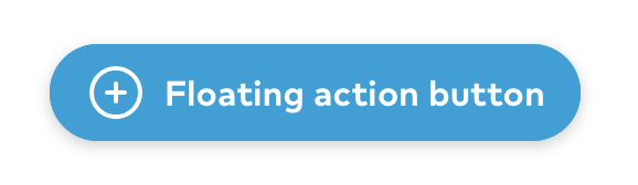
TextFloatingActionButton Primary
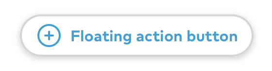
TextFloatingActionButton Secondary
IconFloatingActionButton Primary
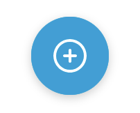
IconFloatingActionButton Secondary
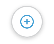
Public API
TextFloatingActionButton theme struct
public let backgroundColor: UIColor
public let borderColor: UIColor
public let tintColor: UIColor
public let highlightedBackgroundColor: UIColor
public let highlightedBorderColor: UIColor
public let height: CGFloat
public let horizontalPadding: CGFloat
public let iconTextSpacing: CGFloat
public let textStyle: Font.TextStyle
public let shadowImage: UIImage?
public init(backgroundColor: UIColor, borderColor: UIColor, tintColor: UIColor, highlightedBackgroundColor: UIColor, highlightedBorderColor: UIColor, textStyle: Font.TextStyle = .title6, shadowImage: UIImage? = UIImage(named: "textFabShadow", in: Bundle.thumbprint, compatibleWith: nil), height: CGFloat = 44, horizontalPadding: CGFloat = Space.three, iconTextSpacing: CGFloat = Space.two)
public static let primary: TextFloatingActionButton.Theme
Primary text fab theme.
public static let secondary: TextFloatingActionButton.Theme
Secondary text fab theme.
IconFloatingActionButton theme struct
public let backgroundColor: UIColor
public let borderColor: UIColor
public let tintColor: UIColor
public let highlightedBackgroundColor: UIColor
let highlightedBorderColor: UIColor
public init(backgroundColor: UIColor, borderColor: UIColor, tintColor: UIColor, highlightedBackgroundColor: UIColor, highlightedBorderColor: UIColor)
public static let primary: IconFloatingActionButton.Theme
Primary icon fab theme.
public static let secondary: IconFloatingActionButton.Theme
Secondary icon fab theme.
TextFloatingActionButton
public private(set) var text: String?
The text displayed. This is a read-only variable. See func setText for setting the text.
public func setText(_ text: String?, accessibilityLabel: String)
Use this function to set the fab’s displayed (text) and read-out accessibility (accessibilityLabel) texts.
public private(set) var leftView: UIView?
This is the view set on the left of the displayed text. This is a read-only variable. See func setLeftView for setting the view.
public func setLeftView(_ view: UIView, largeContentImage: UIImage?)
Use this function to set the left view (view) and the image shown when holding the image while using an accessibility text size (largeContentImage).
public var theme: Theme
public override var isHighlighted: Bool
public init(text: String, accessibilityLabel: String, theme: TextFloatingActionButton.Theme = .primary)
public override var intrinsicContentSize: CGSize
IconFloatingActionButton
public private(set) var icon: UIImage?
This is the displayed icon for the fab. This is a read-only variable. See func setIcon for setting the icon.
public func setIcon(_ icon: UIImage, accessibilityLabel: String)
Use this function to set the icon (icon) and the read-out accessibility label (accessibilityLabel) for the icon fab.