
Components
Modal(Usage)
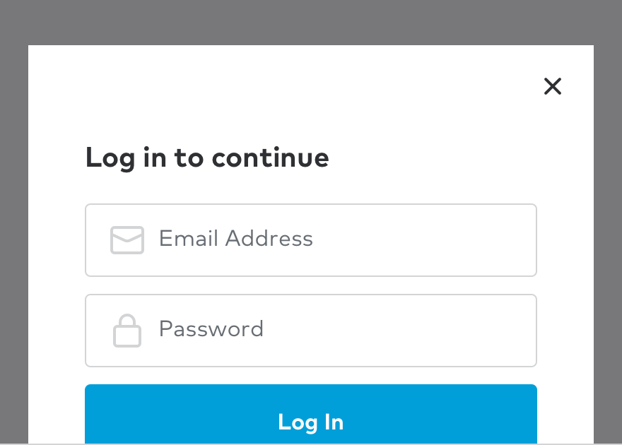
A basic and commonly used modal.
Modal dialogs appear as an overlay on a page. They should be used when Thumbtack requires a user response or needs to explain critical information without losing context of the page beneath it.
Best practices
Use when you want a user to confirm an important action or to get information like signing up or logging in. Since modals do interrupt a users’ experience, they could be perceived as annoying or bothersome and should be used with discretion.
Do not use a modal without a trigger from the user, for example on page load. Also, do not use if there is a modal already being displayed.
Tip
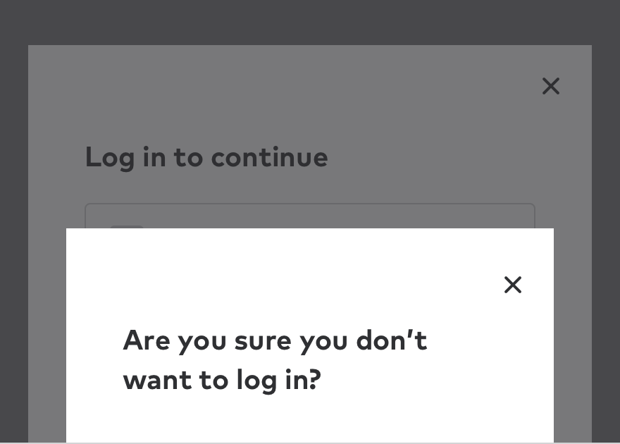
If you need a follow up modal, the original container will stay on the page, and the content will replace itself.
Writing for modals
Context is key. There needs to be a direct connection between the trigger (i.e. a button or link) and the modal that follows. This can be achieved by directly repeating the words of the trigger or using related terms. Maintaining a sense of connection between the CTA and modal transition is important to keep and maintain a consistent user experience.
Tip
Be concise. By doing this, the user can make a decision and get back to the original task.
Behavior
Arrival
How modals arrive is just as important as the content they contain. Animation does more than provide a visually pleasing experience. They indicate to the user that there is something on top of the content they are interacting with.
Dismissing
By default, modals can be closed by clicking on the “x” in the upper right hand corner of the container or by clicking anywhere outside of the container which is called the “curtain”. The animation of the arrival is used, just in reverse.
Autofocus
By default, the focus is placed on the first item a user can select, allowing them to quickly select the requested information, or submit the modal.
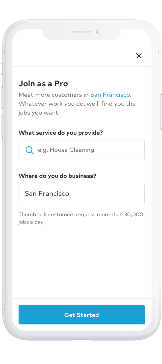
Default Modal
The default modal allows users to interact with and ultimately alter the experience it is currently interrupting. If you find that the number of required elements for your design is making the dialog convoluted, then try a different design solution.
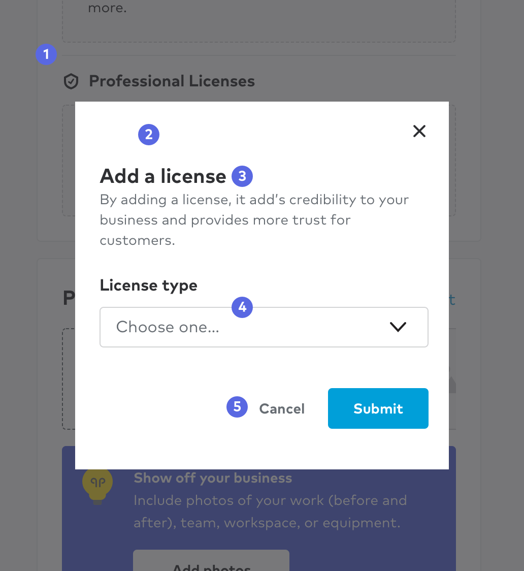
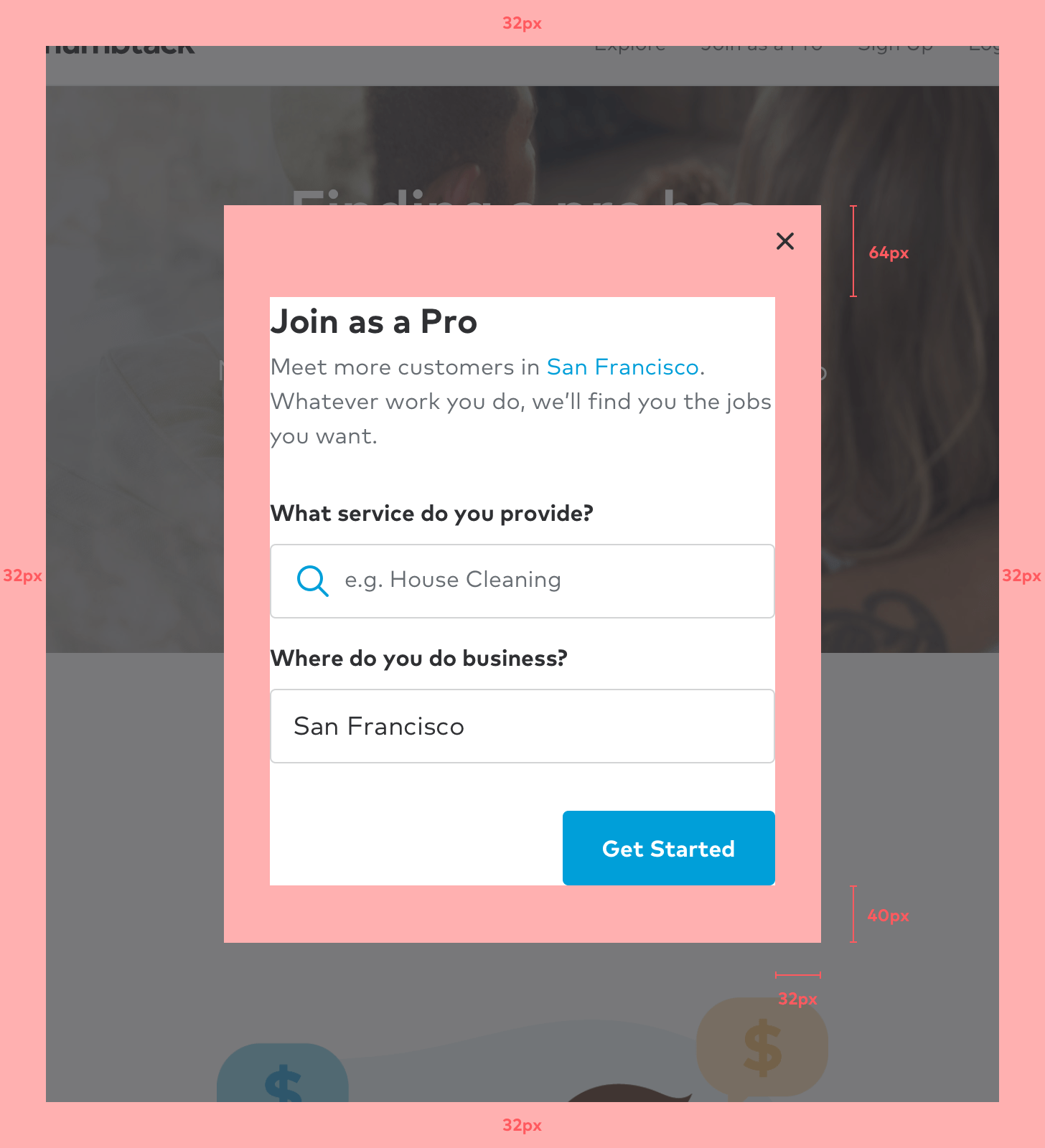
Anatomy
1. Curtain
Covers the underlying content while providing focus to the information being served in the container. Note that there is no curtain below the small breakpoint.
2. Container
As implied, this is where the contents of the modal dialogue such as text, inputs, buttons, and illustrations are held.
3. Title
Reinforces context from the initial trigger on page while providing an overview of the modal.
4. Content
A concise description or simple action a user must address. If multiple steps are required, use a whole page instead.
5 Action bar
Contains the primary action of the modal. All modals must have a primary CTA, and can support secondary CTA’s as well. These actions should speak to and reinforce completing the action they are being asked to complete.
Sizes
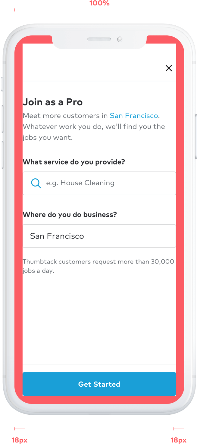
Small breakpoint
Unlike the other modal sizes, the small size is a full screen experience with no curtain. This gives us more space to use and ultimately provide a a better user experience.
Transition
Our website relies on white space to separate content and provide direction for users. With no curtain to separate the modal from the background content, we rely on transitions to reinforce page hierarchy. Our modal on small slides up from the bottom to tell the user that the original content is beneath.
Options
Button can be sticky at the bottom or scroll with modal content.
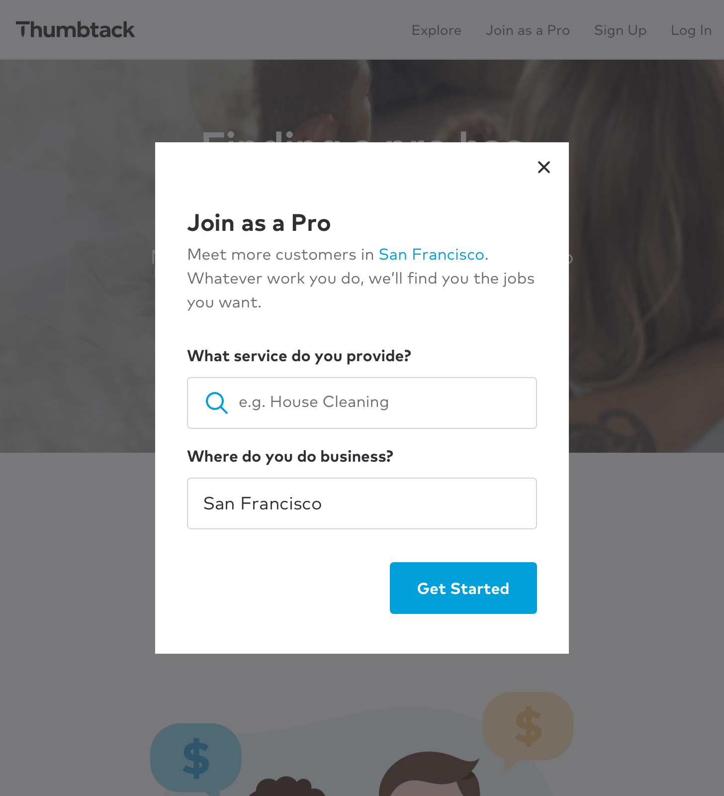
Medium & Large breakpoints
There are two modal sizes; narrow and wide. Each take up a percentage of screen real estate and are responsive to the browser width. You will find two separate symbols in Sketch for the medium & large artboards.
Properties
A modal’s height will grow to fit their content up to 50% of the screen’s height. Beyond that, the content will scroll with in the modal.